This time of year is always a bit special. Many of us have just returned from IFA in Berlin, while others are already gearing up for the next big event—the Canton Fair, which is only weeks away.

At the same time, we've recently celebrated the Mid-Autumn Festival (enjoy our post: here) and in terms of celestial events, we've just passed the Autumn Equinox. This marks the point where day and night are nearly equal in length, signaling the official start of autumn in the northern hemisphere. It’s that time of reflection, with nature slowing down, leaves turning orange, and people preparing for the colder months ahead. If you close your eyes and think of autumn, that vibrant orange hue likely springs to mind.
In a more playful context, we’re also in the middle of the major fashion weeks that set the tone for the upcoming summer. With Milan's Fashion Week just behind us and Paris in full swing, it’s a period full of striking imagery, colours, and iconic logos—perfect timing to dive into the story behind our own logo at Homa.
Ever wonder where the name "Homa" comes from? Or why we chose the colour orange for a brand that’s all about keeping things cool? Well, you're in the right place. This article takes you on a fascinating journey through the history of our firm's name, its logo, and how it reflects the pioneering spirit of our company.
If the origins of the name and logo seem elusive, the year of our founding is not—2002, right in the heart of Guangdong, along the Pearl River Delta. From this industrial hub, Homa took flight with boldness and innovation. We've grown, adapted, and evolved over the years, yet our core values have remained the same. As you’ll discover in the article below, the choice of orange was just the beginning of what has since become our Care Manifesto.
So, sit back and immerse yourself in the captivating story behind our logo—a journey of breaking out of the cocoon. Cognition, ambition, courage, and execution are all woven into this tale of growth.
Enjoy the read!
PS And to enhance the experience, I recommend reading this while listening to Get It Together by Drake featuring Black Coffee. You can find it here on YouTube or here on Spotify
Copyright HOMA 2024- Issued by Federico Rebaudo, General Manager at Homa Europe, September 2024
The shape and sound of excellence
The fascinating story behind Homa’s name, colours and logo.
Picking a name for a company that manufactures appliances going into the homes of millions of consumers worldwide is a fascinating process. Especially since, in the beginning, nobody knew how things would turn out for this fledgling new venture in the heart of Guangdong. There are about as many ways to do it as there are companies in this world, but the story behind the name of this particular company and its name is quite extraordinary, and there are more things to the lettering, the pronunciation, the colours and the shape of the logo than one would imagine at first glance.

Inspired by german iconic automotive brands
Right from the very beginning, the founders of Homa had very clear in their minds what their company would stand for, and set the bar quite high by taking inspiration from two German giants of automotive: Audi and BMW. This also tells a lot about their vision and their aspirations, as they never stopped pursuing technological excellence, outstanding performance, elegance in design and a reputation of total reliability.
It was decided that the name of the new company would be formed by a fusion of the two
German brands’ names, their names written in Chinese being “奥迪” (Audi) and “宝马” (BMW). So the first ideogram from Audi, “奥”, and the last one from BMW, “马”, were combined, reading, respectively, “ow” and “mah”, “Ow- mah”!
What was particularly interesting to founder Shier Kai and his early companions was that, in the Latin alphabet, the shape of the letter “O” is perfectly round, and laden with symbolism. It is the shape of Earth, and hence embodies the vision of the company to make products for the world.
Also, the circle is a symbol of inclusion, of community and of infinity, all positive values that well describe the spirit of Homa.
In addition, the new name sounded like the word “Home”. Nomina sunt consequentia rerum, it perfectly fitted the products’s primary aspiration: taking center stage in millions of homes around the world. Homes, rather than houses, for Homa’s products aim to provide that same sense of reassuring, emotional comfort and care for end customers and their families. An “H” was added, and the final lettering trimmed to the present “Homa”, which was to become a household name in cool technology, performance and design. Incidentally, the final “a”, respecting the Chinese pronunciation of 奥马, when rotated left by 90°, turns into an “e”, leading back to the concept of “home”.
The warm colours of cool
The story of the bright, warm Homa orange is equally interesting. Colours associated to cooling products and technology are usually on the cold side of the spectrum, but Homa decidedly went the opposite way. Orange better reflected its people’s enthusiasm and passion, which are far from cold!
Orange is an attitude: of positive thinking, of continuous progress and open-mindedness. Helping people preserve their food at its best and share it can bring them closer together and create warmer, emotional connections can’t be anything but orange!
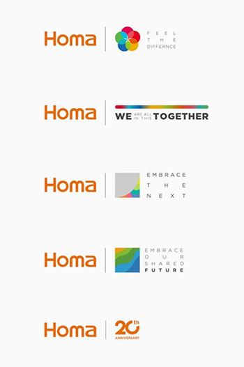
Other colours have also been introduced since.
The orange seeds of hope Homa sowed in the cooling industry have grown and blossomed into colourful flowers, reflecting the company’s attention and care for the diverse cultures of partners, clients and suppliers.
It started in 2019 with the “feel the difference” theme for that year’s Canton fair and continued in the following years with different visual interpretations.
In the midst of the pandemics, because of the travel and public gatherings restrictions the event had to be virtual. Homa attributed each colour an individual value shared with its partners, blending together in the logo with the payoff “we are all in this together”.
Namely, courage; creativity; wisdom; inspiration; trust; sharing; support; passion; dream and caring. It continued in October of that same year with “together we share more” and the coloured leaves theme, a strong hint at resilience, growth and team spirit.
In April 2021, the event’s leitmotiv was “embracing the next”, again underlining the spirit of pioneering and the urge to move forward and adapt to an evolving world.
It only slightly changed into “embrace our shared future” in October 2021, to open up new perspectives, openly referring to sustainability, and reinforce the concept of sharing and caring…
The 20th anniversary logo and its auspicious secret
Homa’s 20th anniversary logo has a clean and engaging design, as in the purest Homa tradition. But again, like all things Homa, there’s more to it than appears at first glance. The "zero" of the 20 has exactly the same shape and is in the same font and thickness as the "O" in Homa, to remind us of the international vocation of the company. A section of the ring has been cleared to accomodate the "th" element. The portion that was removed corresponds to exactly 20% of the total circumference of the circle. Homa has every intention of reaching the 100 years mark, and its "first" twenty years are exactly 20% of that not-so-secret ambition!
To obtain your copy of our commemorative monograph, please reach out to your sales representative or contact us directly at Homa Europe.
Copyright HOMA 2024- Issued By Homa Marketing dept. on September 2024
For further Information and Press Contacts: info@homaeurope.eu

