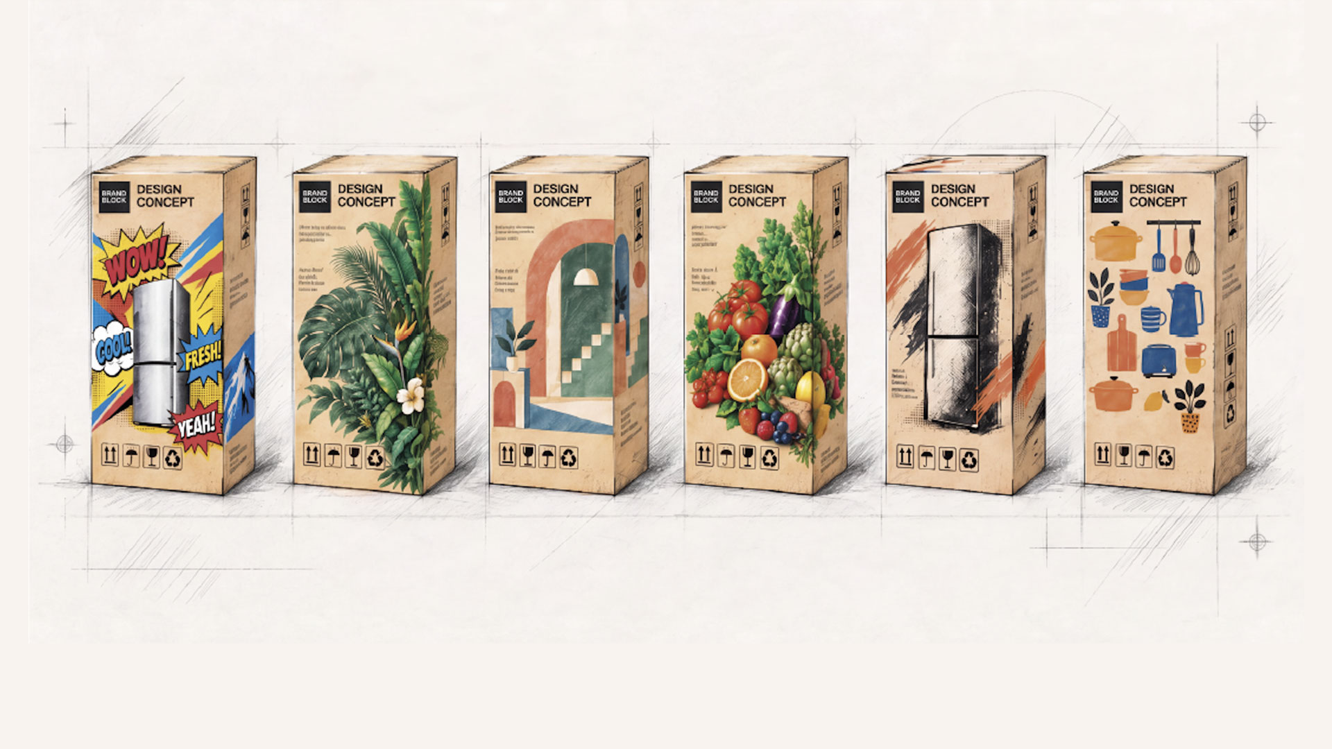
Turning packaging from a functional necessity into a brand touchpoint.
The experience of a new refrigerator begins long before it enters the home. The appliance may be discovered online, compared in store, or selected from a catalogue. Its packaging is part of that journey too: protecting and presenting the appliance as it moves through warehouses and retail spaces, is handled by logistics teams and installers, and finally reaches the threshold of the home.
For decades, that tall cardboard box has been treated almost entirely as a technical object. Its job was clear: protect the appliance, survive logistics, carry essential information, arrive intact. In the industrial logic of large home appliances, packaging has often been seen as a necessary cost, not as a strategic surface.
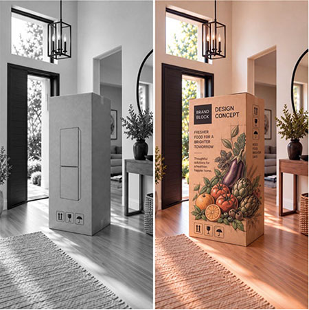
The project was initiated and strategically guided by Federico Rebaudo, General Manager of Homa Europe, with the ambition of helping Homa's partners compete through differentiation, not price alone. Creative development was entrusted to Studio Volpi, with the freedom to translate the strategic objectives into original design directions.
Yet the box is large, visible and unavoidable. In many cases, it is the first large-scale physical expression of the brand that the customer actually sees, and it passes through more brand moments than many campaigns, from factory and logistics to retail, doorstep and unboxing. The wider relationship between packaging and brand image has also been explored in consumer research. This is the simple shift at the heart of Homa's packaging project: not a merely decorated carton, and not a cosmetic exercise, but a branding-led packaging platform designed to inspire customers' own brands and to support private labels.
The ambition is simple: to turn the box from a cost item into a communication asset, an existing industrial object made communicative.
The project is also a concrete expression of the thinking explored in Homa's white paper, The New Shape of Differentiation.
The project begins with a specific reality of Homa's business. In OEM/ODM markets, the same industrial expertise can support customer brands with completely different positions, audiences, price tiers and ambitions: retailer-owned private labels seeking stronger shelf presence, emerging brands that need to look more established, importers that need faster market tools, and mature brands looking for new ways to communicate value without redesigning the product itself.
This is not a weakness. It is one of the strengths of the model. Shared platforms make scale, competitiveness and speed possible. They allow industrial knowledge to move across markets and product families, reducing complexity where complexity does not create value.
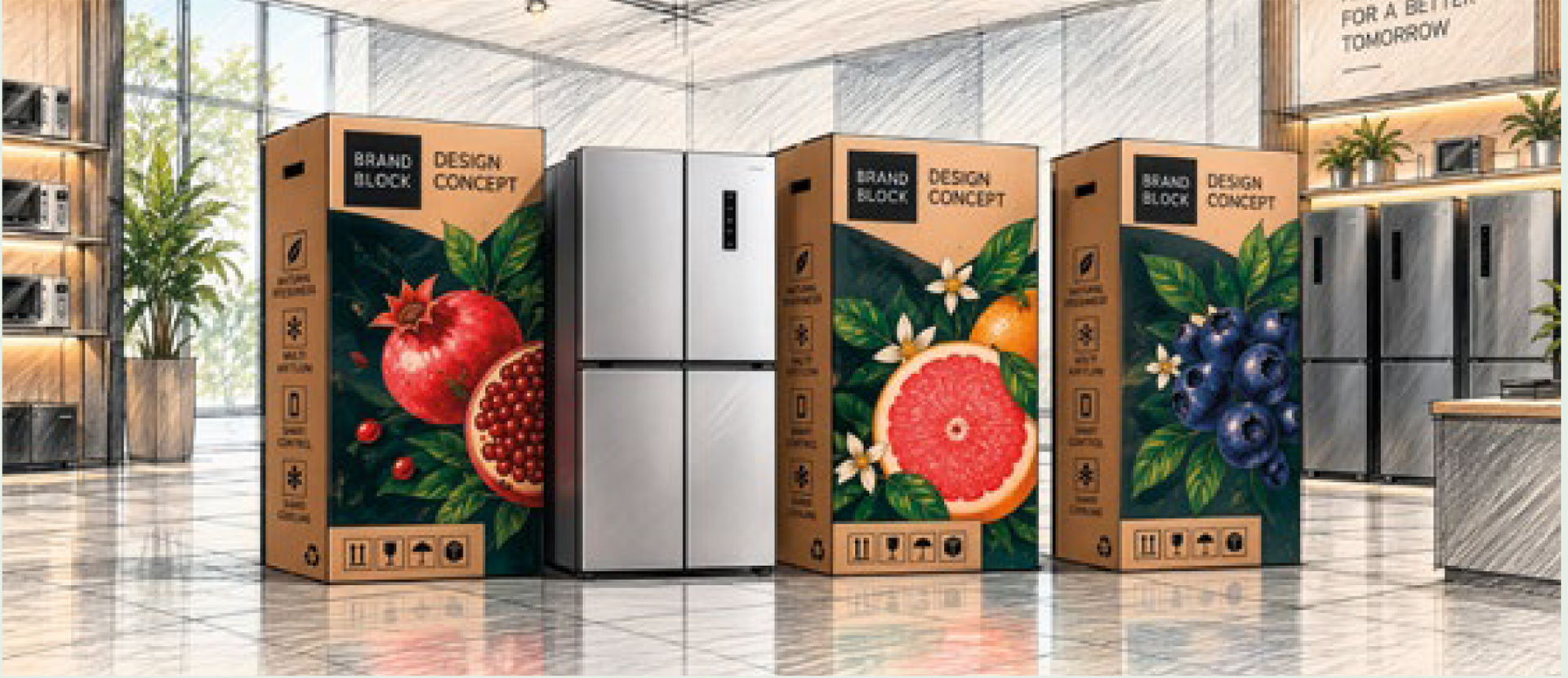
This relationship between industrial capability, market understanding and different customer identities is also explored in Homa Europe's Like an Olive Tree.
But shared platforms also create a challenge: how can different customer brands avoid looking generic before the product has even been unpacked?
Packaging is often where that risk becomes visible first. A product may be carefully engineered, efficiently manufactured and well adapted to a customer's market, but if its carton looks anonymous, the difference remains hidden until later in the journey.
For Homa, the opportunity is not to create a Homa packaging identity. The system is not organised around one house style, but around the possibility of many customer expressions. It works in the layer where perception is formed: graphics, tone of voice, information hierarchy, visual rhythm, imagery, claims and product storytelling.
The central idea of the project is not to make packaging "nicer". The goal is to create perception options: distinct visual and verbal territories that help different customer brands express how they want to be seen.
A private label competing on reassurance should not speak like one competing on performance. A premium line should not organise information like a playful entry-level brand. A technical, evidence-led brand should not use the same rhythm, density or emotional register as a lifestyle-driven one.
This is where the project uses the twelve brand archetypes as a working framework. The archetype is not illustrated literally: the result is not twelve fixed templates. It is a packaging grammar: visual language, verbal tone, surface treatment and materials.
This distinction matters: templates are rigid and trends expire, while a grammar can adapt.
A shortcut to meaning, not a costume to wear.
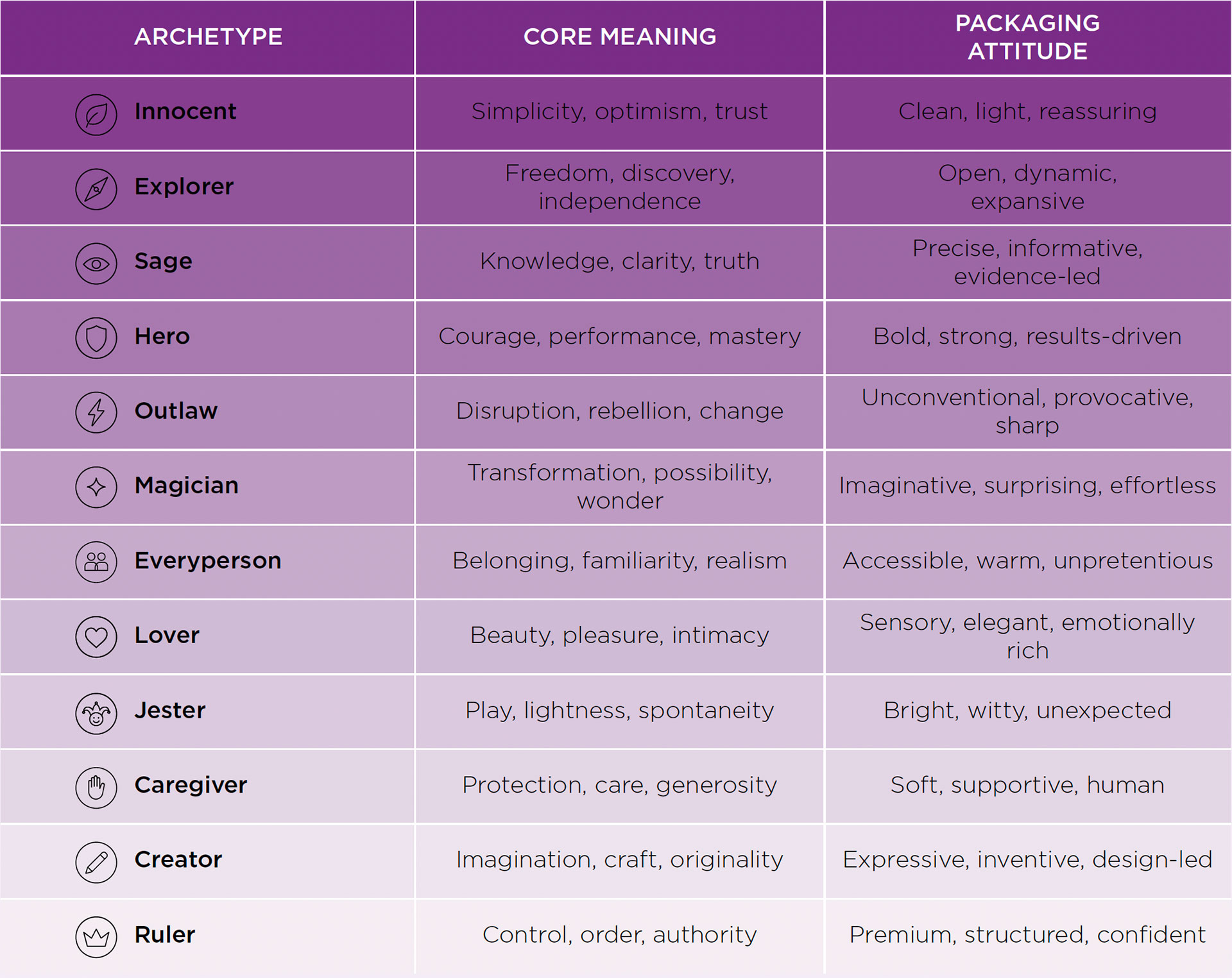
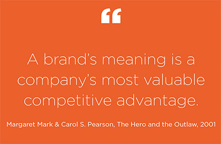
The idea of archetypes originates in C. G. Jung's work on recurring symbolic patterns in the collective unconscious. The familiar twelve-archetype framework used in branding, however, is a later applied system developed by Carol S. Pearson and popularised for brand strategy by Margaret Mark and Carol S. Pearson in The Hero and the Outlaw (2001).
Designing for perception means recognising that packaging is often the first point of contact between a brand and its audience. Before a product is touched or tested, consumers form expectations through visual cues, language and information hierarchy. For this reason, every design choice contributes to shaping not only recognition, but also the values and personality associated with the brand.
In branding, archetypes are not characters to be copied literally. They are meaning patterns: a way to clarify a brand's deeper motivation, tone of voice, relationship with its audience and type of promise. For packaging, this makes them especially useful: an archetype can guide how a surface behaves without forcing every brand into the same visual language.
Archetypes are not a predictive science but a working framework: they do not measure a brand; they give it a coherent character. A brand that behaves like a consistent, recognisable character is easier to remember and trust.
Once the archetype becomes a visual and verbal grammar, the box stops being a neutral surface. It begins to behave like a brand territory.
A Caregiver direction might use soft hierarchy, reassuring language and everyday gestures. A Sage direction might rely on evidence, clarity, diagrams and a more precise technical voice. A Ruler direction might use controlled silence, space, order and authority. A Creator direction might allow more visual invention and compositional originality. A Hero direction might make robustness, capacity and performance feel immediate.
Each territory can be adjusted to the customer's identity, market, brand maturity, price positioning and production constraints. The archetype provides direction, but the final expression remains open enough to become specific to a real customer brand.
In appliance categories, much of the product's real value is difficult to perceive immediately. Energy efficiency, cooling stability, air distribution and long-term reliability all matter deeply, but they often require explanation — and the product may even remain packed until delivery.
Packaging can help bridge that gap: not by overloading the carton with technical claims, but by making the product's promise more legible. This relationship between technical capability and understandable design is also explored in When Design Becomes Language.
A Sage-inspired box can turn preservation technology into confidence. A Caregiver-inspired box can connect freshness to family care. A Magician-inspired box can make invisible microclimates feel like transformation. A Hero-inspired box can make capacity and strength immediate. A Lover-inspired box can give beauty and domestic pleasure a stronger role.
Differentiation means making the most relevant value easier to recognise.
The box still protects, still moves, still carries handling information. What changes is the ambition: instead of treating the carton as a silent industrial wrapper, Homa treats it as differentiation infrastructure: a scalable surface where customer brands can begin to express who they are, what they value and how they want their products to be perceived.
This makes the project emblematic of a broader shift in differentiation. Not every meaningful difference has to sit inside the product. Some differences live around it: in content, retail experience, unboxing and the first physical contact between brand and customer. Sometimes the most powerful move is not to add another feature, but to recognise an existing touchpoint and make it work harder.
In that sense, the packaging project is not a side story to Homa's thinking on differentiation. It is one of its clearest examples.
A shared platform can still create ownable identities. A necessary box can become a brand environment. And a surface long treated as anonymous can become the first place where a customer feels that this product was never generic at all.
Copyright HOMA 2026- Issued By Homa Marketing dept. on November 2026
For further Information and Press Contacts: info@homaeurope.eu